Modernizing the AMS’s Join/Renew application to scale with current and future membership goals.
Project type: UX/Product Update

Re-building the Join/Renew process to improve the
AMS Membership experience.
Overview
The core of the American Meteorological Society's (AMS) mission involves building its membership base and supporting member needs. The Join/Renew application usually follows an initial positive interaction with the AMS, and is often the first active process a user engages in with the organization. Analytics data has shown that a user's experience during this process is a crucial factor in whether they complete the process and also whether they renew down the line.
The last update to the Join/Renew application was made in 2015. Since then, many changes to the process have been made and tacked on to the existing app. Years of accrued design debt had made the process clunky and confusing. This case study explores the re-design of this application to meet modern standards and provide an intuitive user experience.
Role
Visual Design Manager - Research, Strategy, Wireframing, UI Design, Prototyping, Development Support, Iteration Maintenance, User Testing
Team
Front-end developer, Senior Back-end Developer
Leadership (Membership Director, Digital Products and Technology Director)
Membership Department Staff
Project Management
The Goal
AMS membership has been experiencing stagnation in member numbers since a large dropoff during the Covid-19 pandemic. To reduce barriers for users wanting to become members, the Join/Renew application was reviewed and a need for modernization was identified. The goal of this project was to streamline what had become a clunky application and modernize the UI to be more in line with modern standards.
The Problem
The last major overhaul of this application was nearly 10 years ago. Since then, the Join/Renew process had changes in the information that is collected. These changes were added to existing steps of the application that were deemed the best available fit. This has led to a process that is logically clunky and disorganized. Analytics data showed an increasing trend in dropoffs of users at each step of the process throughout the years. Regularly conducted Membership surveys also indicated that the application's interface was cumbersome and confusing to navigate. We wanted to re-design the app so that each step was more streamlined, as well as modernize the UI to be more intuitive.
The Approach
Discovery and Research
We started with an audit of our existing application to review all of the process's form fields. We checked these fields against our business needs and organizational requirements to add, delete, or keep fields we need.
This project was an opportunity to add features or changes that had been expressed in user surveys. Qualitative survey data was analyzed and categorized by type of sentiment using an affinity diagram exercise with the membership team. The top changes requested were related to the maneuverability within the process. The existing app did not have a way to go back and forth between steps, save progress once a step is complete, or give the user a sense of how long the process is. This overhaul gave us a chance to add these features.
Once the list of fields was finalized, we conducted benchmarking research to identify existing examples of similar applications.
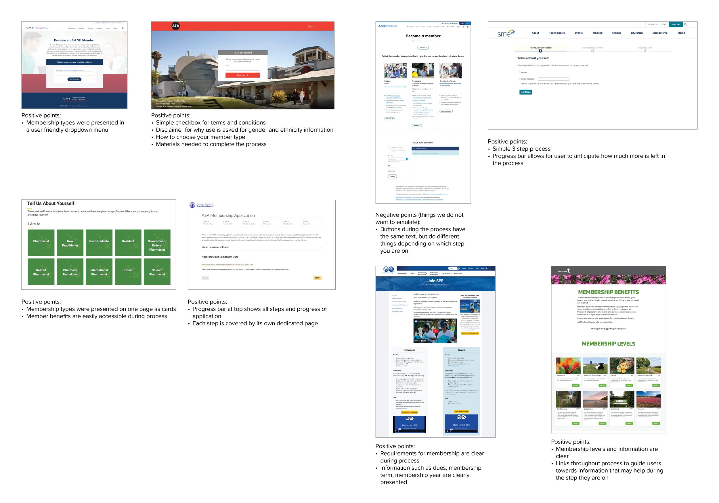
Benchmarking Research
Product Planning and Wireframing
Drawing from these benchmarking examples and research, we created a user flow diagram of the overall process and a preliminary wireframe to visualize a basic structure of steps.
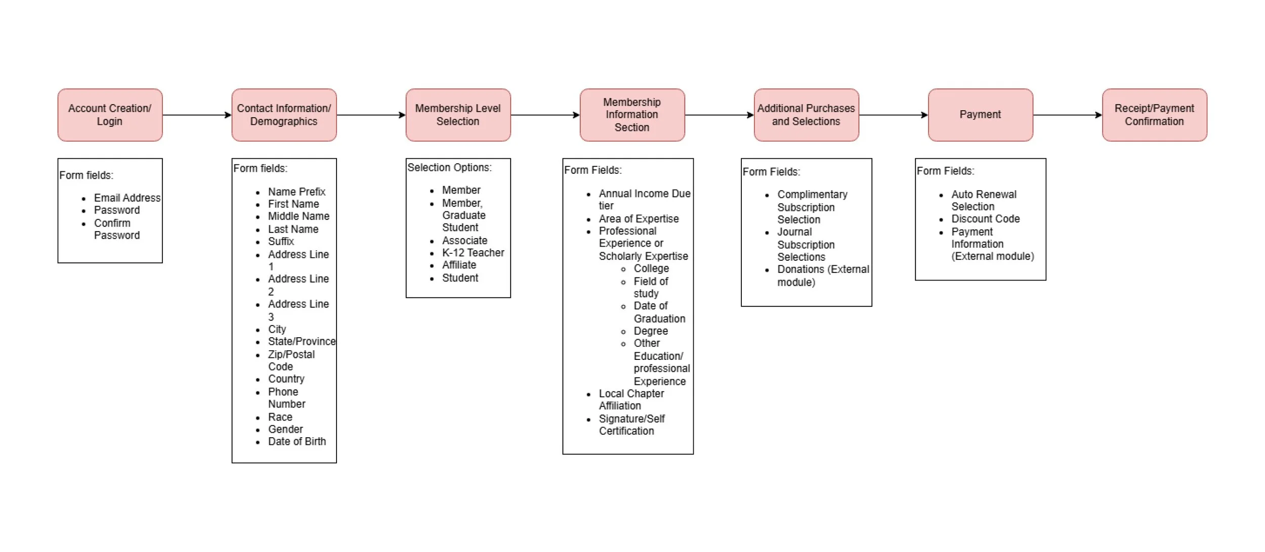
User Flow Diagram

Wireframe of User Flow
Design and Testing/Iteration
The base flow was approved and interactable prototypes were developed. The user interface was developed by drawing upon all of our internal research and project requirements. Pre-existing modules such as our payment module or receipt module were used whenever possible.
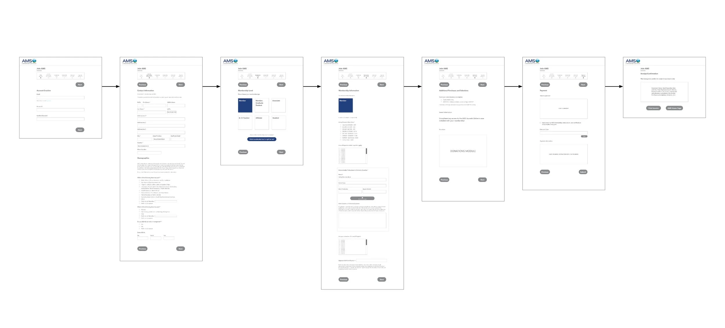
Prototype Screens
User testing was conducted with the prototypes and iterated on until a final version of the application was approved. The prototypes were handed off to the engineering team for development.
The Results
The final prototypes underwent development and early alpha versions were put through internal user testing to ensure all interactions were working as intended. Unfortunately, due to company budget issues and the loss of engineering staff, the project was postponed indefinitely until budget concerns were resolved. The Executive team and Membership department were optimistic about the release of the new application and had planned for it to be a significant part of the next cycle of new member recruitment marketing campaigns.
Next Steps
The uncertain development timeline of the project redirected the focus of the design team toward additional needs within the Membership application. There was a need for additional processes that covered different membership types, as well as a similar process that covered membership renewals. The research conducted and the final prototype designed in this project were used to develop alternate prototypes that covered these additional needs. All prototypes are ready to be handed to an engineering team as soon as development can resume.
While the intended final product is not yet complete, we were able to use findings from this project to improve upon other areas within the membership department. A project that branched off from this one was the revamping of web content around becoming a member and membership benefits. This was an effort to provide as much support as possible before a user decides to engage with our existing Join/Renew Application.